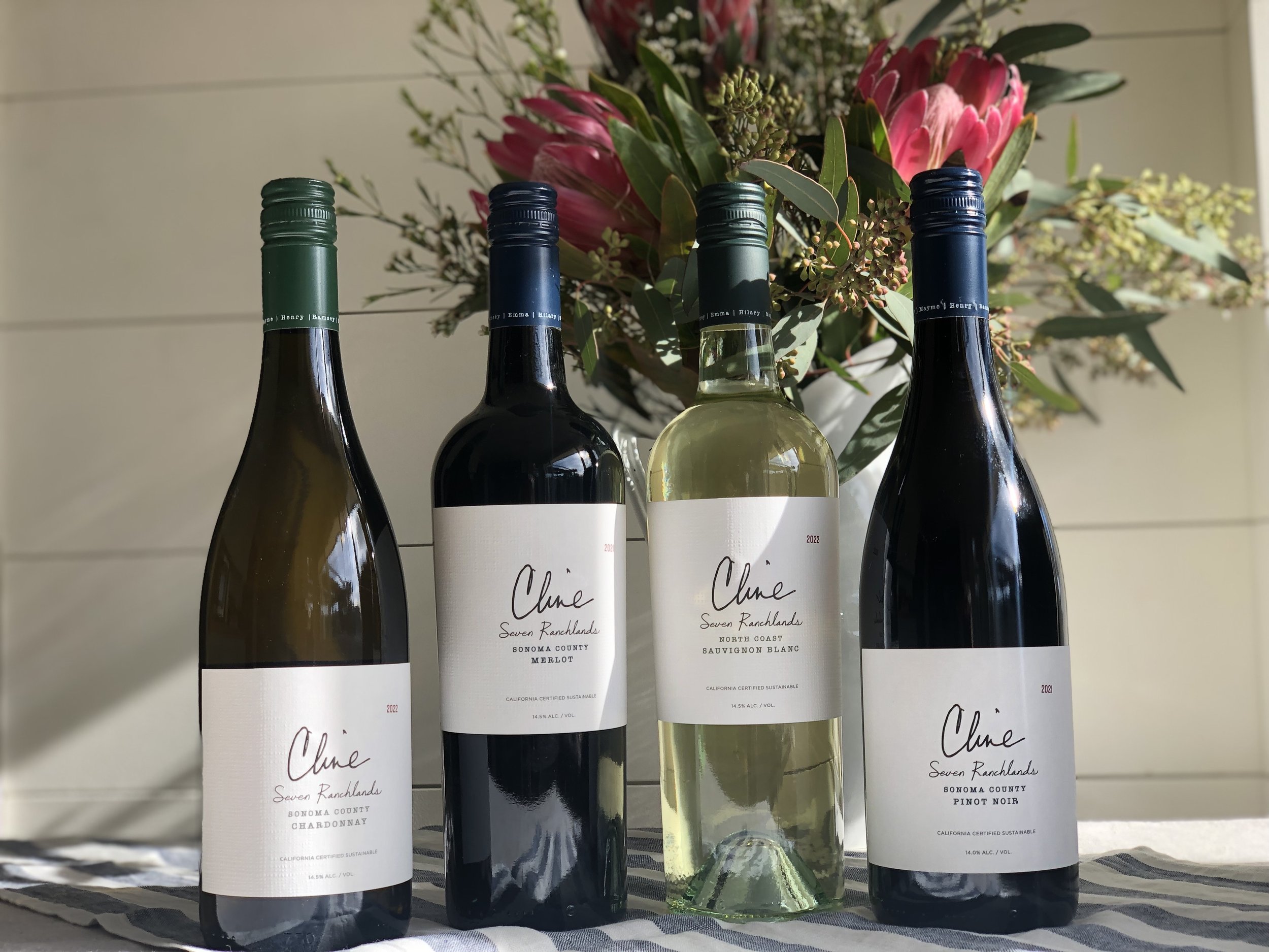
Seven Ranchlands Series
Sometimes a project is more than just making a pretty label. Sometimes extra thought and discussion must be held to reaffirm it’s entire reason for being. Along the way, as we explored the goals of the original creative brief, we all noticed hesitancy amongst each other at the design reviews. No one was really all that excited. So I stepped back, and at the request of one of the key stakeholders, I tried something completely different both in the design and the storytelling of this wine.
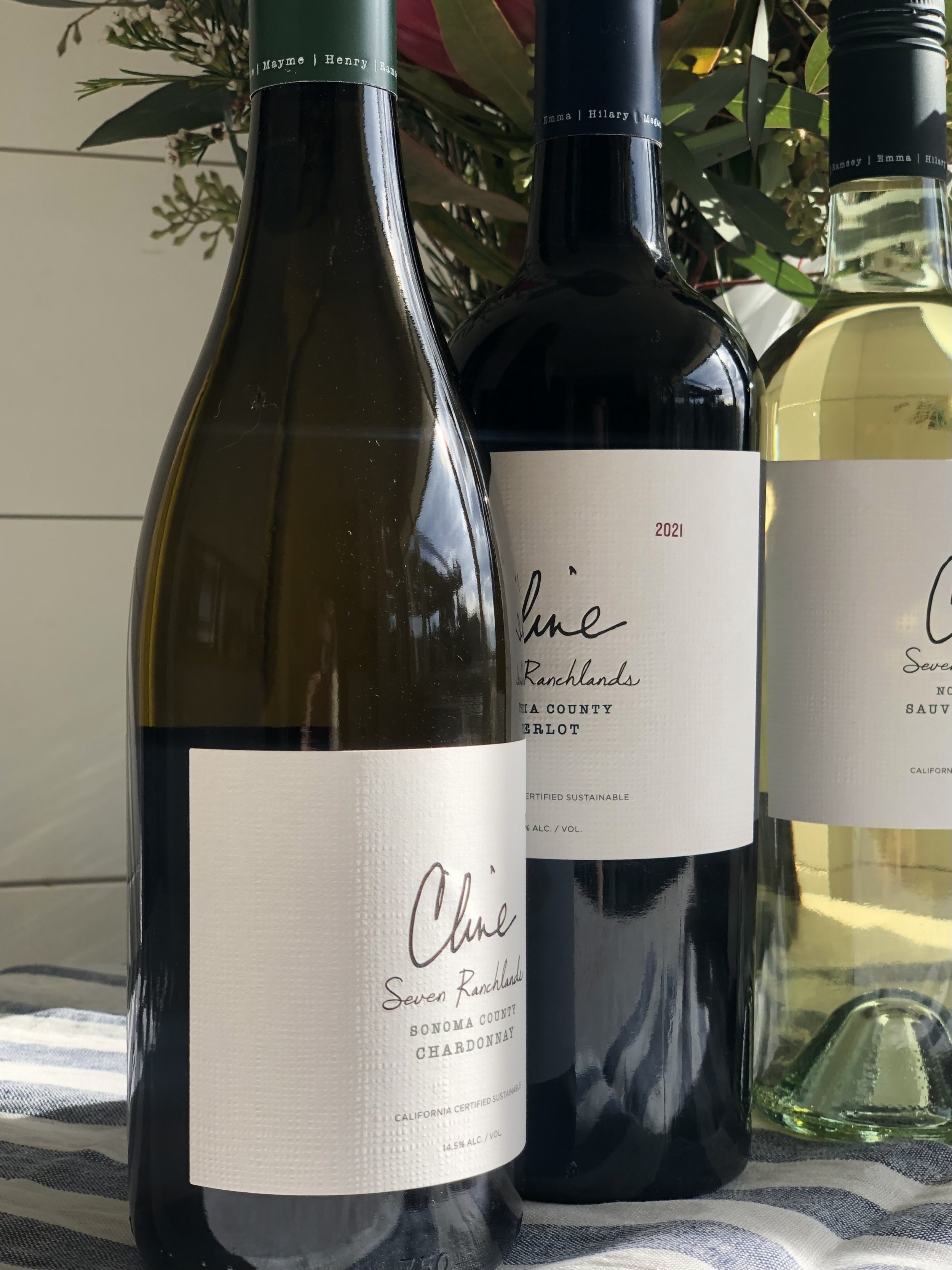
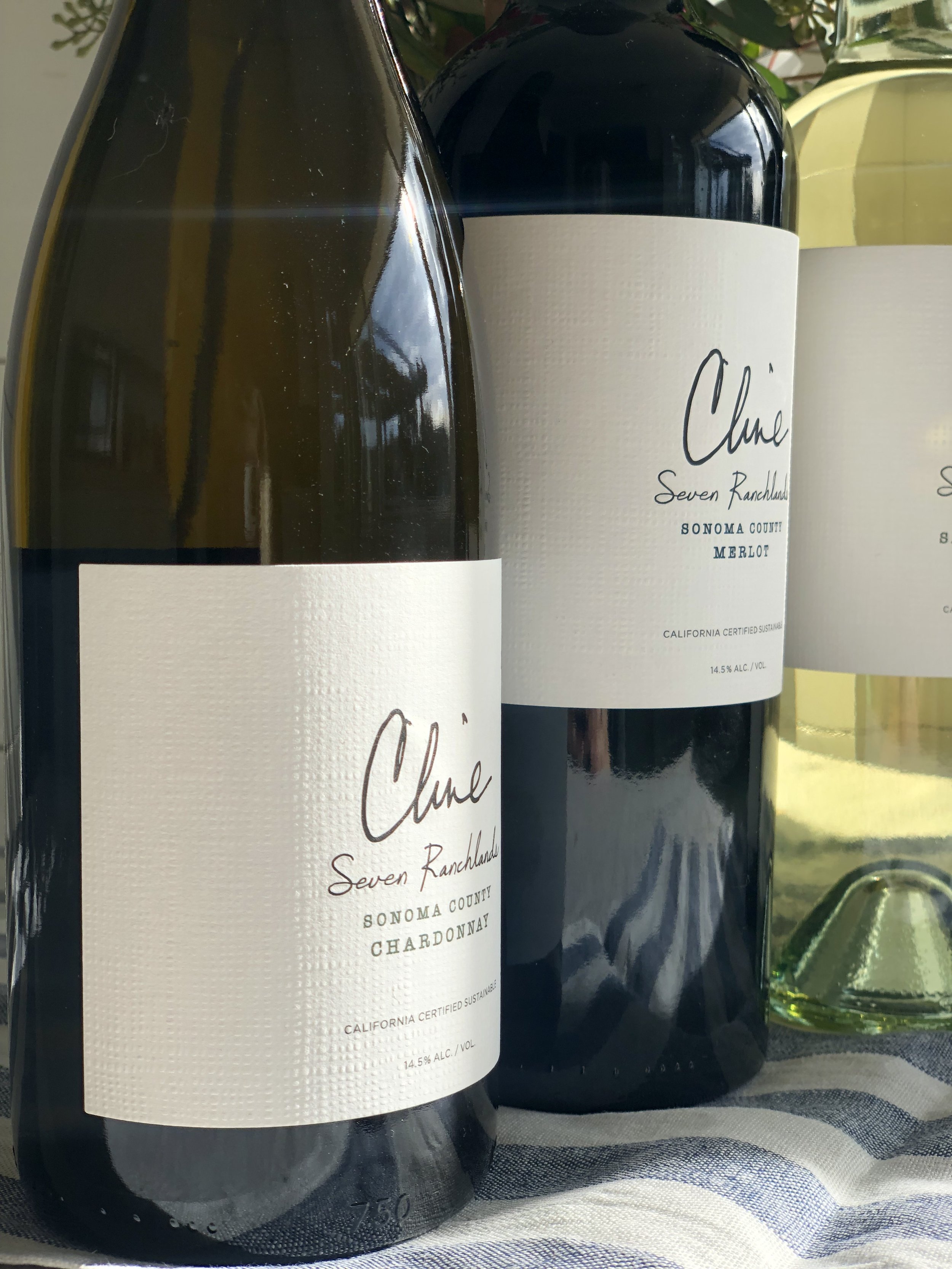
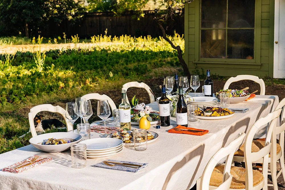
Seven Ranchlands is the Cline’s on-premise only brand, which meant that it was only fitting that this label looked completely different from it’s off premise cousins. This tier evolved into paying tribute to the entire Cline legacy, their seven children and their seven different ranches. We began to tell the story of how this wine was crafted primarily to enjoy with food, more specifically a wine that the family enjoys when they gather together.
This new logo came from the signature of the family patriarch, the back label a tribute to the family from the parents, and all seven of the children’s names grace the skirt of the capsule, giving an even more personalized touch.